


The Yellow Strawberry builds robust, thoroughly documented design systems in Mumbai for startups and enterprise organisations, creating the unified design language your teams need to build faster, more consistently, and with total brand fidelity at any scale.
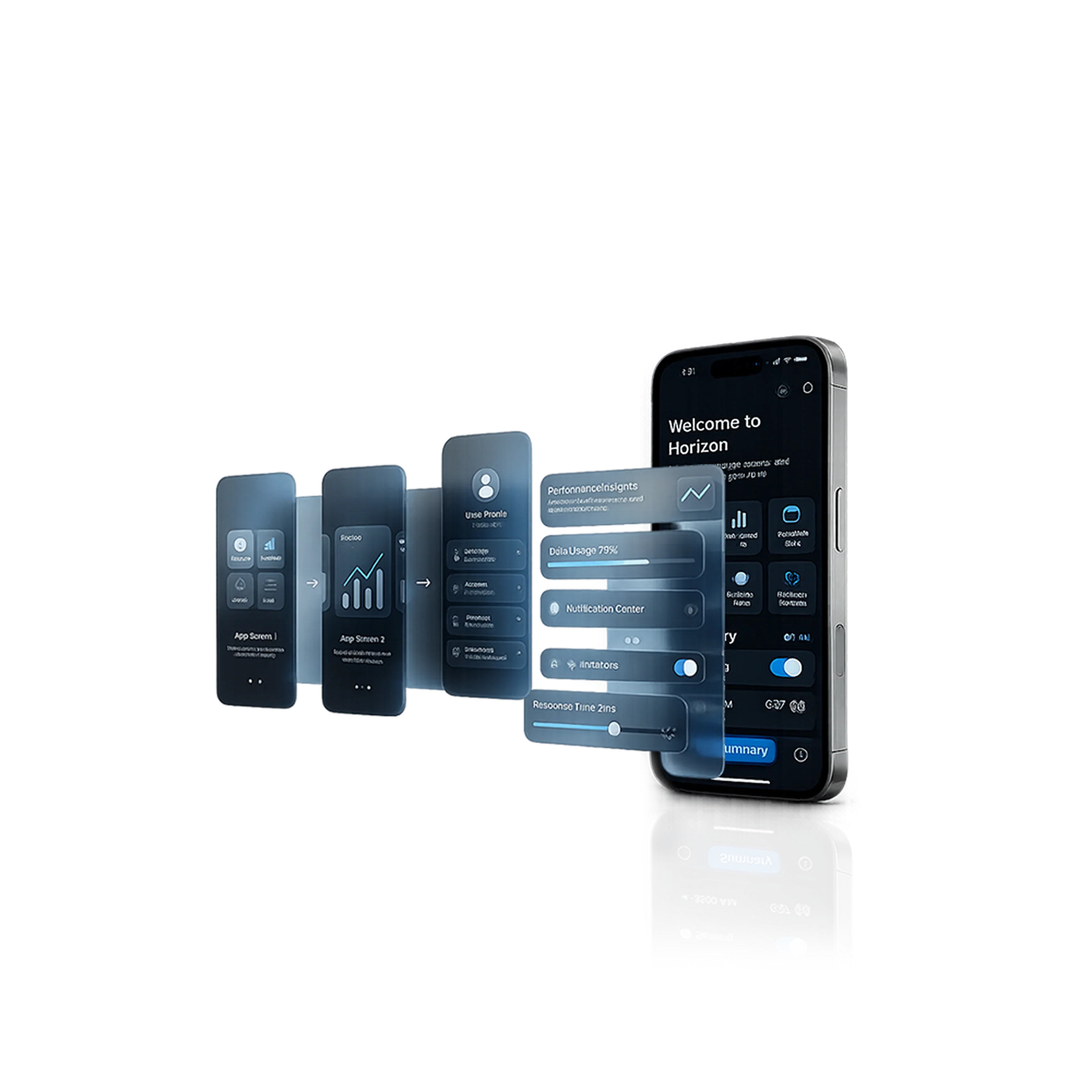


A design system is the single most powerful long-term investment a scaling digital product company can make. It is not a style guide, not a UI kit, and not a component library in isolation; it is a living, collaborative ecosystem of design tokens, reusable components, interaction patterns, brand guidelines, accessibility standards, and documentation that fundamentally transforms how your design and engineering teams work together. At The Yellow Strawberry, our design system development services in Mumbai have helped organisations ranging from 5-person startups standardising their first component library, to 500-person enterprise engineering teams harmonising fragmented design languages across multiple product lines. We understand both the design craft of building beautiful, versatile components and the organisational strategy of getting teams to adopt, govern, and maintain a system over time. The result is always the same: a design system your teams actually use, that reflects your brand precisely, and that measurably accelerates your product development velocity from the very first sprint it is implemented in.


A well-built design system ensures your product looks and behaves consistently across every platform, every product line, and every team; no matter how fast you grow.
iOS App Interfaces
Android App Interfaces
Web Platforms
SaaS & Dashboard Products
Desktop Applications
Multi-Product Organisations
iOS App Interfaces
Android App Interfaces
Web Platforms
SaaS & Dashboard Products
Desktop Applications
Multi-Product Organisations

Our design system services in Mumbai cover the full spectrum of design system work from foundational token architecture to comprehensive component libraries, pattern documentation, accessibility integration, and team adoption strategy. We build systems that last.
We establish your design system's foundational layer, the design tokens that govern every visual decision in your product. Colour palettes and semantic aliases, typography scales, spacing systems, border radii, shadow definitions, motion timing values, and breakpoint specifications; all systematically defined, consistently named, and documented so that any single change propagates correctly and automatically across every component, platform, and theme your product supports.
We build a comprehensive, expertly organised Figma component library containing every UI element your product requires. Every component like buttons, forms, inputs, navigation systems, cards, modals, data tables, notification patterns, empty states, and more is built with full variants, all interactive states (default, hover, active, focused, disabled, error), responsive auto-layout, and clear usage documentation. The result is a Figma library your designers can build with at high speed while maintaining perfect, effortless consistency.
We bridge the critical gap between design and development by structuring your design tokens for seamless, automated export to code using tools including Style Dictionary, Figma Variables, and Theo ensuring that your Figma design system and your production codebase stay in perfect, perpetual synchronisation. Design changes in Figma propagate to code cleanly, eliminating the manual re-implementation work that creates inconsistency between design and built interfaces.
Beyond individual components, we document the higher-level patterns; the recurring combinations of components that solve common product UX problems. Empty state designs, error and validation handling patterns, loading and skeleton states, onboarding flow structures, notification system logic, form validation patterns, and data visualisation standards. Your teams receive precise guidance on when to use each pattern, how to combine components correctly, and what variants are appropriate for different contexts.
Already have a design system that has become fragmented, inconsistent, undocumented, or abandoned by your teams? We conduct a comprehensive audit of your existing system; identifying inconsistencies, duplications, missing components, accessibility gaps, and documentation deficiencies and deliver a prioritised evolution roadmap with clear recommendations for consolidation, standardisation, and re-adoption that transforms your system back into the genuine team asset it should be.


User Interface

Wireframing
Prototyping


Design System


UI/UX Design Overview
Every digital product team eventually reaches the point where design inconsistency, slow UI development, endless style debates, and fragmented brand representation start costing real time and money. A professionally built design system from The Yellow Strawberry solves all of these problems simultaneously and creates a foundation for building better products faster at any scale.
Teams working from a mature design system ship new features dramatically faster than teams without one. Designers aren't rebuilding common components or debating visual decisions from scratch. Developers aren't re-implementing UI patterns or asking designers for specs they already have. Everyone moves faster because the foundation is already built.
A design system ensures that every screen, every product, every platform, and every team member produce work that is visually consistent and on-brand automatically, by default, with no extra effort. Brand consistency at this level is impossible to achieve through guidelines and manual review alone once a product scales.
When designers and developers work from the same shared component library with the same token values, the friction, misinterpretation, and re-implementation errors that characterise most design handoffs disappear. Design-to-code consistency improves dramatically, and both teams spend significantly less time on communication overhead and rework.
As your design and engineering teams grow, as new products are added to your portfolio, and as freelancers and agencies are brought in to contribute, a design system ensures that every contributor produces work that meets your standards without requiring constant senior oversight. It encodes your team's best design decisions into a shared resource that scales automatically.
When accessibility standards are built directly into your design system's components; correct colour contrast ratios, WCAG 2.1-compliant focus states, keyboard navigation support, and ARIA annotation guidelines, every product your teams build is accessible by default, without requiring separate accessibility reviews for each new feature or screen.


Our experience spans multiple industries, helping businesses build and grow through digital.
Information Technology
E- Commerce
Healthcare & Pharma
Education & E-learning
Travel & Tourism
Banking & Finance
Media & Entertainment
Hospitality & Food Service
Building a design system that teams actually adopt and that truly scales with your organisation requires both exceptional design craft and deep product operations experience. The Yellow Strawberry brings both. Our Mumbai-based design system team has built systems for organisations at every stage of the product maturity spectrum; from pre-launch startups creating their foundational component library, to multi-product enterprises unifying fragmented design languages that evolved independently across five product lines and three separate design teams. We understand the technical requirements of design token architecture and design-to-code integration, the organisational dynamics of getting designers and developers to adopt and contribute to a shared system, and the governance structures needed to keep a design system healthy, current, and actively used over time.
Our design system engagements begin with a thorough discovery phase, auditing your current design state, understanding your team's workflow, mapping your product portfolio's component needs, and identifying the token architecture that will serve your organisation both now and as you scale. We involve your design and engineering teams in the process from the beginning, because a design system built without team input is a design system that won't get adopted. We use the Agile methodology throughout, delivering usable components and documentation in regular sprints so your team starts benefiting from the system before the full engagement is complete.
What makes The Yellow Strawberry the right design system partner for your business is our combination of deep Figma expertise, production-grade token architecture knowledge, and genuine understanding of how design systems need to function within real product organisations, not just how they look in portfolio presentations. A design system from The Yellow Strawberry is delivered, documented, adopted, and built to evolve with your product for years to come. We don't just hand over files, we hand over a system that works.
A structured, team-inclusive design system process built for adoption, scalability, and long-term maintainability.

We begin with a comprehensive audit of your current design state; reviewing existing UI patterns, component usage, brand guidelines, team workflows, and technical stack. We map your product portfolio's full component requirements, define the design token architecture, establish documentation standards, and provide a transparent, phased project timeline and cost estimate before system development begins.
Our design system team creates a detailed system architecture plan: defining the token hierarchy, component inventory, naming conventions, variant structures, documentation format, and the design-to-code integration approach. This plan is reviewed and approved collaboratively with your design and engineering leads before any component building begins, ensuring the system's architecture will genuinely serve your organisation's specific needs.
We build the design system in structured, prioritised sprints; starting with design tokens and foundational components (typography, colours, spacing, buttons, forms) and expanding to more complex components and patterns. We share work-in-progress component libraries regularly for your team's review and incorporate feedback through collaborative working sessions, ensuring the system reflects your brand and your team's practical workflow needs precisely.
We deliver the complete design system as a fully documented, live Figma library with comprehensive usage documentation, contribution guidelines, governance protocols, and maintenance recommendations. We conduct formal onboarding sessions for your design and engineering teams to ensure confident, independent system adoption. A post-delivery support period is included to answer questions and support your team's initial period of working with the new system.
A foundational design system for a single product covering core tokens, a primary component library, and basic documentation typically takes 3–6 weeks. A comprehensive enterprise design system covering multiple platforms, extensive pattern documentation, code token integration, and full documentation typically take 1–2 months. We scope each engagement individually based on your product portfolio's complexity and team size.
Adoption is where most design system projects fail and it is where The Yellow Strawberry invests particular care. We include team workshops, live onboarding sessions, contribution process documentation, and a governance framework as standard parts of every design system engagement. We also recommend a post-delivery support period during which our team is available to answer questions and help resolve adoption challenges as they arise in real-world usage.
Engage with us for your project or campaign requirements. Please share all the details, and we’ll reach out to you with the next steps.